
Taurus
Financial literacy app for children
Role
UI designer, Art director
Tools
Figma, Canva
Target users
Parents, children between the ages of 10-12 years old
Role
UI designer, Art director
Tools
Figma, Canva
Target users
Parents, children between the ages of 10-12 years old
UI Design
Competitive analysis, visual branding, prototype
Problem
Throughout the client's presentation, the research did not address the success rate of this course or whether the course had any impact or influence on the children following the completion of the course.
Goal
The goal of this course is to help you determine what will be the most effective way to increase engagement levels so that the course can provide any kind of benefit for the user that will have a long term impact on them by bringing the right kind of visual branding and visual design that will connect with parents and look appealing to children. This will encourage parents to enroll in the course, while the children will understand and retain the material.
Project
In order to create a pleasant, welcoming environment for the children to learn in, Taurus needed to create a room that had all the components to enable the children to focus on their tasks and continue on to the next lesson. As part of the process of developing a long-term strategy, I first needed to conduct some basic market research in order to gain a more comprehensive understanding of the current market conditions and the needs of our target audience. In addition, the client was also seeking a visual brand based on the first concept that they had introduced to me.
%201.png)
Problem scoping
In my approach, I focused on data collected from the user research, and competitive analysis
Week 1: Research and competitive analysis
User research
To kick off the project and to achieve the objective, I initiated three qualitative interviews with parents as well as three qualitative interviews with children, as a way to get a better understanding of their expectations and to gain insights into what kids are interested in and influenced by nowadays. After the interviews were transcribed, an empathy map and affinity diagram were constructed to group all interviews into a complete understanding of what to look for in a competitive analysis.
User research interviews
In order to find out what both parents and children were looking for and would be interested in in a course app, three parents and three children were interviewed between the ages of 10, 11, and 12 years old. The user insights were as followed,
- In selecting products for their children, parents look for products that are safe, dependable, dependable, and trustworthy
- Video games and vibrant colors are the preferred style of the children when it comes to colors
- According the Tiktok, YouTube, and other apps that are popular among kids are influencing what they do
Competitive analysis
A competitve analysis was carried out in order to gather information of all the current competitive products available on the market. It is still unresolved that there is a problem that exists. My focus was on what would be appealing to both parents and children when I was designing this project.
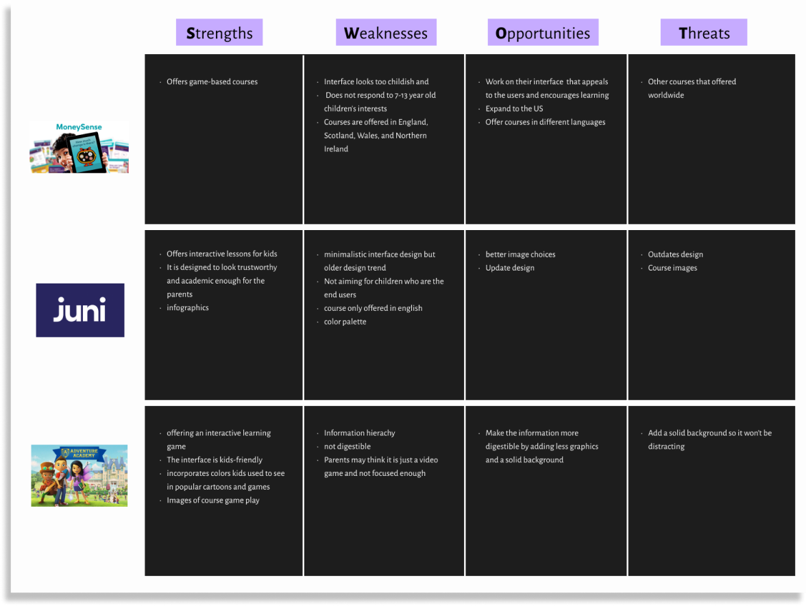
Key takeaways
- In terms of parent-targeted products, a child-friendly interface and a higher degree of engagement could be provided by such products
- I think the appearance of the products is bland or old school, and they seem to be too childish and dull
- The majority of the products do not have a version for mobile devices
Opportunities
- According to the National Consumers League, the 10-11 age range appears to be the usual age range for pre-teens to receive a cell phone. As many as six out of ten of the pre-teens who had their own phones at the time were between the ages of 10 and 11. 20% of 8-9 year olds and 15% of 12-year olds received a cell phone.
- There is a great potential for the development of a prominent brand that would feel both authentic and reliable for parents and entertaining and engaging for children that would be readily available for all platforms.
Week 2: Visual branding and prototype
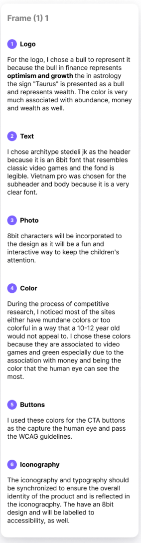
Visual branding
After completing user research, I developed a set of key values that a brand should possess in order to resonate with both parents and children: caring and thoughtfulness, reliability, top-notch quality, dependable, flexibility, accessibility, a children-friendly environment, and competence. It is my intention to create a mood board for the project as well as a few sketches.
%201.png)
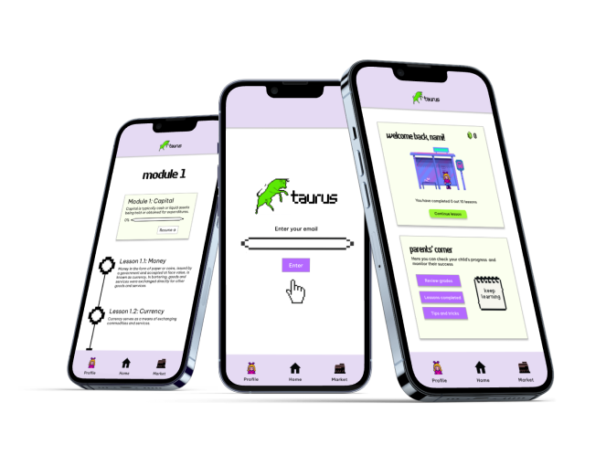
Finished design
To complete these screens for the Taurus application, I incorporated some of the concepts from the mood board I created. This game is designed to be akin to 8 bit classic games, such as Street Fighter, Super Mario Bros., and Pac Man, such as the famous 1981 Super Mario Bros. game. This course will allow the user to choose and customize an 8-bit character that will follow them throughout the entirety of the experience. As users advance through their modules and lessons, they will be able to spend the currency they earn and add more items to their customized 8bit characters, in a "marketplace" where they can use the currency they gain from advancing through their modules and lessons. Basically, the currency in this game is called "munnies" similar to the currency used in the legendary game "The Legend of Zelda".
%201.png)
%201.png)
%201.png)
%201.png)
Reflection
I am happy with the results of this product but due to my tight deadline, I could not spend as much time on researching, testing and revising the designs. I focused only on the UI portion of the product as that was what was assigned to me. I will say that jumping straight in to the UI portion was quite a learning experience. In the future, I would like to work with education professionals and gaming professionals to further develop this application in order to make sure users can gain a thorough understanding of financial literacy and have an entertaining and pleasurable experience while learning financial literacy.