
Puffer
AI-driven content generator
Role
UX/UI designer
Tools
Figma, Canva
Target users
Marketers of all kinds: email, social media, bloggers, content writers, social media managers, etc.
Role
UX/UI designer
Tools
Figma, Canva
Target users
Marketers of all kinds: email, social media, bloggers, content writers, social media managers, etc.
UX/UI Design
Open card sort, usability testing, competitive analysis, wireframes, prototyping
Problem
In order to increase the number of new customers signing up and, consequently, grow the number of loyal customers, Puffer is looking to grow its brand awareness among potential customers. To promote its product among potential customers and increase sign-ups, Puffer is looking for a new marketing page to be built.
Goal
Understand what will be the most effective way to guide users through the activities available within the app once they have been created and identify elements of the design of the app and its key features that could be improved upon and/or re-designed
Project
For Puffer, a social media manager and content creator AI content generator, the client wanted a responsive marketing website that would be intuitive and branded. For our team to be able to build a lasting solution, we first needed to perform some basic research to learn more about the market segment and our target users. The client also searched for a visual brand for the application based on their first concepts.
%201.png)
Problem scoping
In my approach, I focused on data collected from the usability testing and Lo Fi prototype.
Week 1: Research and usability testing
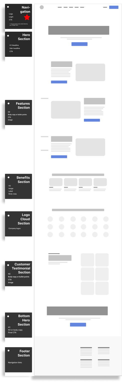
Sitemap and testing
To begin, the sitemap was drafted based on the content presented by the client, which was then aligned on by our team. After the design was complete, we conducted a usability testing with low-fidelity prototypes and then performed a card sort among users within our target audience in order to assess how the system performed. We were able to gather data through these research methods, as well as a brief interview, in an effort to obtain data on how users conceptualize different types of content on the site in an organic way, and confirm or contradict our initial assumptions. Qualitative insight into their perspectives and thought processes was gained through the brief interviews.
%201.png)
Target users
Three users who are in their 20s and 30s that fit our target users criteria participated in this testing. Our target users are aimed at content creators who are busy marketing professionals. It is expected that the majority of users are familiar with existing tools (HootSuite, Rytr, etc.). It is our intention to recruit participants who fit the profile of our target users, but we will also recruit some participants who aren't marketing professionals or have little to no experience using similar tools for usability testing to ensure we test all aspects of our design.


Open card sort
We performed an open card sort of the page titles in our first draft sitemap in order to test whether users had a clear idea of what website content belonged together and whether the titles of our web pages were comprehensible. In order to categorize each card, users had to choose their own categories from those presented. It was through the open card sort that we were able to get a better understanding of what end users expected to see rather than assuming what categories would be present.
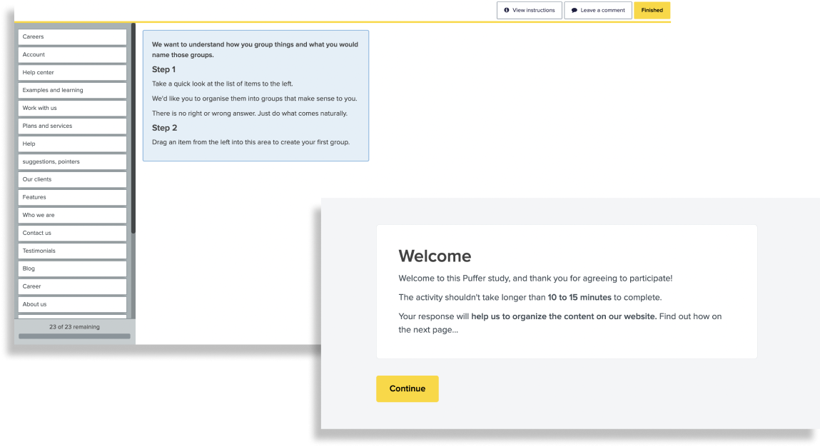
Usability testing
A low-fidelity prototype was presented to the same users after a simple card sort and a user task was posed. To help us determine which was the best prototype from the two, we walked each prototype through with each user and compared the usability experience of each prototype with the same task in order to determine which was the best one of the two. By comparing the effectiveness of each prototype at different stages of the prototyping process, we were able to use our observations and suppositions as the framework for designing prototypes at the same time as we built prototypes based on user data.
%201.png)
Findings
Our assumptions were confirmed by the data we collected as a result of the testing, which indicates that we were right in some of our premises. The labeling of the categories was excellent on the part of all the participants, and the labels were generally consistent with what we were aiming for when we created the cards. According to both the card sort and the usability test, as well the qualitative interviews, we have been able to find out the following:
- Users wanted to see an overall simpler top navigation
- top navigation is straightforward
- Categories were as-is or refined to the brand ("About Us" to "About Puffer")
Competitive analysis
After conducting user research, Puffer conducted a competitive analysis of the various websites in order to develop its website map and design. A great deal of attention was paid to the information architecture and visual branding of our competitors' websites, as well as their information architecture.
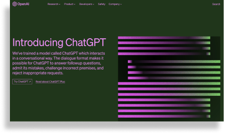
ChatGPT
- Simple top nav
- includes search in top left
- too much to digest on landing page
- Too much space between footer nad end of page (confusing)
- CTA not prominent
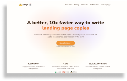
Rytr
- Simple top nav
- easy to digest
- A lot of info in footer
- CTA is clear
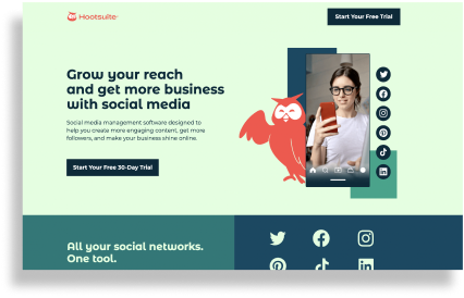
Hootsuite
- no top nav
- footer info is only “Free 30-day trial) button
- CTA is clear but not much contrast to the rest of the page
Week 2: Marketing site
Fine-tune
The team was able to develop different approaches on our high-fidelity prototypes based on the learnings and early prototypes we developed with Puffer, as well as the materials Puffer provided us with, so as to offer the client a wide range of visual options and directions during the design process as the double-diamond design continues to progress.
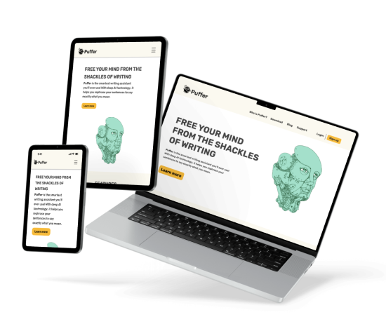
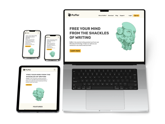
Puffer needed to have a user-friendly, responsive, accessible, and brand-consistent marketing site that could be easily updated as well as responsive. In accordance with the given style guidelines for color, typography, and photography. The marketing site has an easy-to-digest layout and is easy to understand. A key aspect of the Puffer brand is that it contains images of individuals and of real life scenes that illustrate the Puffer values. Towards respresenting diversity and conveying the warmth of their brand, we paid close attention to choosing pictures that exemplified the warmth of their personality.
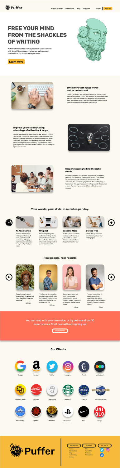
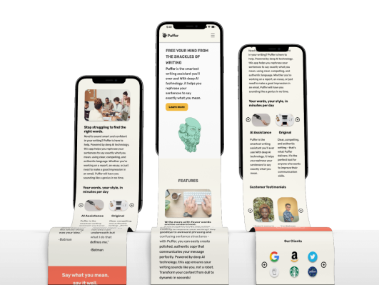
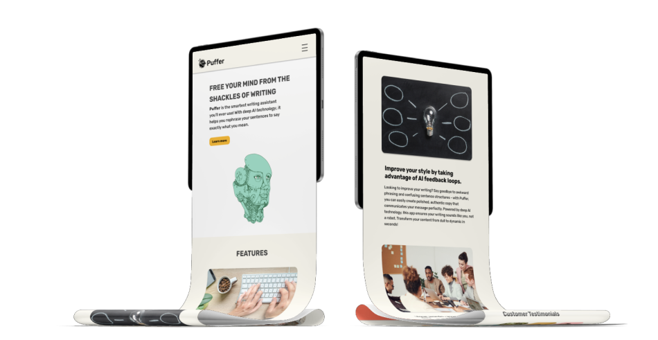
Finished marketing site
- Based on user testing and our competitive analysis, the top navigation is designed in such a way that it is intuitive and easy to use only including content that is of significance to prospective users of the Puffer service.
- The hero section aims to carry out a number of tasks: graphic provided by Puffer, an introduction of the product concisely and in a friendly manner, and includes a primary CTA button.
Puffer needed to have a user-friendly, responsive, accessible, and brand-consistent marketing site that could be easily updated as well as responsive. In accordance with the given style guidelines for color, typography, photography, and the logo and graphic provided by Puffer. The marketing site has an easy-to-digest layout and is easy to understand. A key aspect of the Puffer brand is that it contains images of individuals and of real life scenes that illustrate the Puffer values. Towards respresenting diversity and conveying the warmth of their brand, we paid close attention to choosing pictures that exemplified the warmth of their personality.
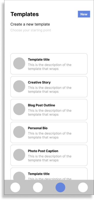
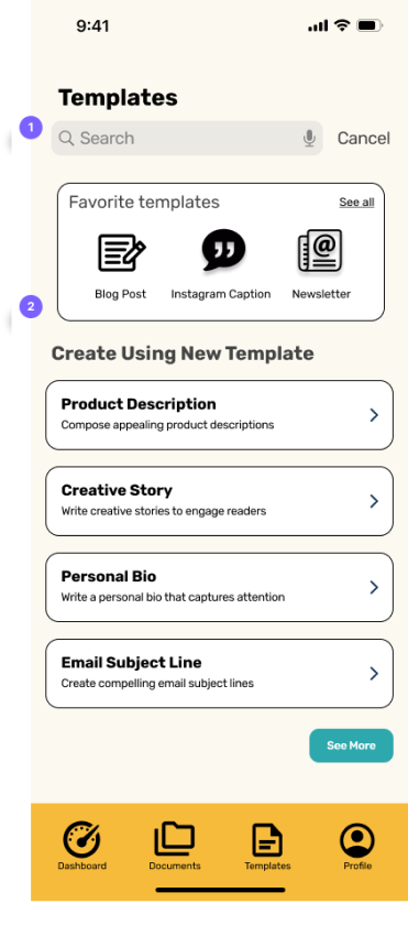
Week 3: Mobile app
Puffer: The Mobile App
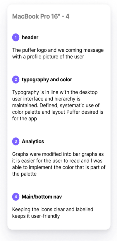
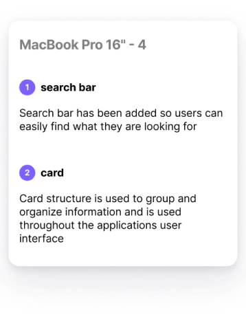
Based on the previous visual development of Puffer's marketing website, and implementing the layout and the functionality for Puffer's mobile app understanding and working on early wireframes for Puffer's mobile app, I adapted the previous visual development and implemented the layout and functionality according to the wireframes. By incorporating the same brand style across platforms and providing a consistent user experience across platforms, I was able to achieve the same brand identity across platforms. After forming the initial ideas about the project, I followed the Double Diamond design pattern which was similar to what I did before with branching out to explore potential ideas and possibility and then coming to a consensus on the most successful features based on the available information.
Rapid sketches
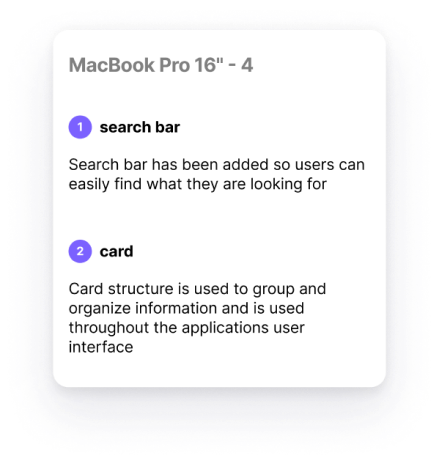
I started out by using a fast and efficient way of sketching ideas during the process of generating ideas, which is the 6-8-5s sketching technique, which is a systematic way of sketching ideas within five minutes (sketches which contain six to eight ideas within a five minute time limit). With the help of this technique, I was able to better understand the specific features found within each screen as well as the structure and layout of each screen in order to better understand their purpose. With the wireframes that were supplied by the client, I examined them in detail and wanted to ensure that the Puffer's design decisions may be refined and polished up.
%201%201.png)
%201%201.png)
%201%201.png)
%201%20(1)%201.png)

%201%202.png)
%201%20(1)%202.jpg)

Input and Output
The user will always be the most important person in the design process. I always keep that in mind to be versatile in my approaches. Our testing pool was small due to the tight timeline, but it had an impact at the time on the design nevertheless. It was important to me that accessibility was prioritized during my design process and I ensured that I maintained the brand style throughout all platforms. In spite of the fact that there is still a great deal to learn and room for improvement, I am satisfied with the final design and it was very helpful to receive feedback from stakeholders and users regarding the final design.