
Pedagogy
School searching app
Role
UX/UI designer, UX researcher
Tools
Figma, Canva
Target users
Parents, students
Role
UX/UI designer, UX researcher
Tools
Figma, Canva
Target users
Parents, students
UX research
Qualitative interviews, Empathy map, Affinity diagram, Competitive analysis, User flows, Usability testing
UX/UI design
Sketching, Low-High fidelity wireframes, Task flows, Visual and interactive design
Problem
Parents in the decision-making process of choosing a school for their child need a way of researching the best schools that fit their criteria for the best education and experience for their children.
Goal
The primary goal is to understand parents' struggles and needs when choosing the right school for their child and being able to come up with an app to ease that stressful process.
Project
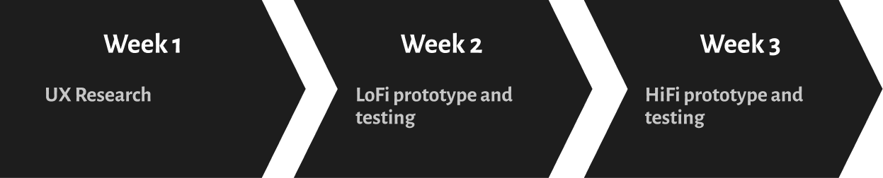
It was the client's request to research how parents decide where to send their children to school and to identify what elements are most important to them when it comes to making that decision. Deadlines were to be met each week for the duration of three weeks, at which the client would inspect the end product.
Problem scoping
It was the client's request to research how parents decide where to send their children to school and to identify what elements are most important to them when it comes to making that decision. Deadlines were to be met each week for the duration of three weeks, at which the client would inspect the end product.
Week 1: Research
Empathy map & affinity diagram
It was the client's request to research how parents decide where to send their children to school and to identify what elements are most important to them when it comes to making that decision. Deadlines were to be met each week for the duration of three weeks, at which the client would inspect the end product.
%201.jpg)
%201.jpg)
- Tuition information
- School ratings and reviews
- Location information
- Contact information
- It is not uncommon for classes to be overcrowded
- Inadequacies in the provision of special needs accommodations
- Recommendations from different sources
- Short of communication
- Not being held up to the standards that was shown during open houses and interviews
- Tuition information
- School ratings and reviews
- Location information
- Contact information
- Tuition information
- School ratings and reviews
- Location information
- Contact information
Competitive analysis
For the purpose of analyzing how well a competitor compares with its competition, I used the SWOT (Strengths, Weaknesses, Opportunities, Threats) approach. In order to do a competitive analysis and determine the market, I found the technique of devising an empathy map in conjunction with an affinity diagram to be one of the most valuable tools I had. I was able to draw upon what I had learned from the interviews I transcribed and how I would be able to determine what opportunities this market could provide by building on what I had learned from the interviews.
%201.png)
Opportunities
Based on the information I had collected, I was able to come up with the following conclusion: the users are parents that care about their child(ren)'s education as this will be the place where they spend most of their days. They wish for them to have a positive experience while doing so. When users are looking for schools, they often become frustrated, lack the confidence and time to find the ones they want. There are some things that the competitors can provide, but not as many in depth as they need.
Direction
- More effortless experience to book school tours directly through the application
- Improve the user-friendliness of the application by shortening the steps and decreasing the time it takes to get to the school results
- Offer the ability to filter and sort our results in order to make a personalized search according to your specific wants and needs.
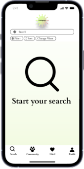
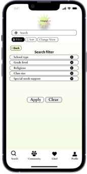
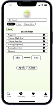
Week 2: Lofi prototype & testing
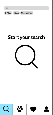
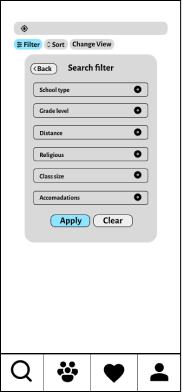
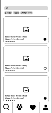
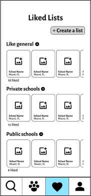
User flow and wireframe sketches
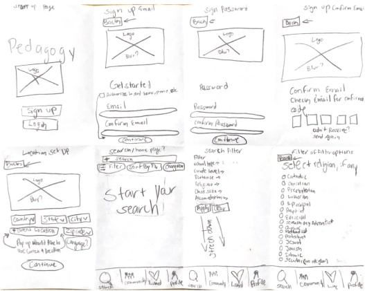
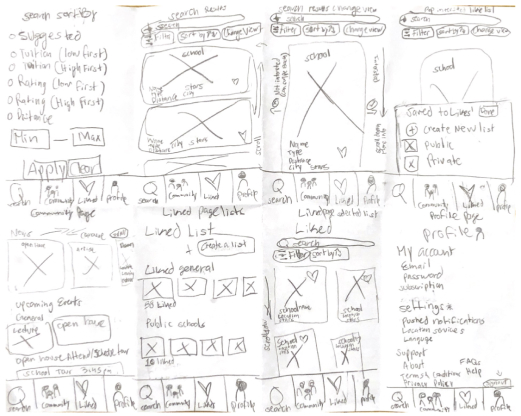
During the second week of my project, I began to focus my efforts on developing low-fidelity mock-ups for this application after I focused on the most important features that would set the application apart from its competitors. Then, I came up with a user flow illustrating how this application would behave within the system. A sketch of the window was drawn on how it might appear once it begins to take shape.
%201.jpg)
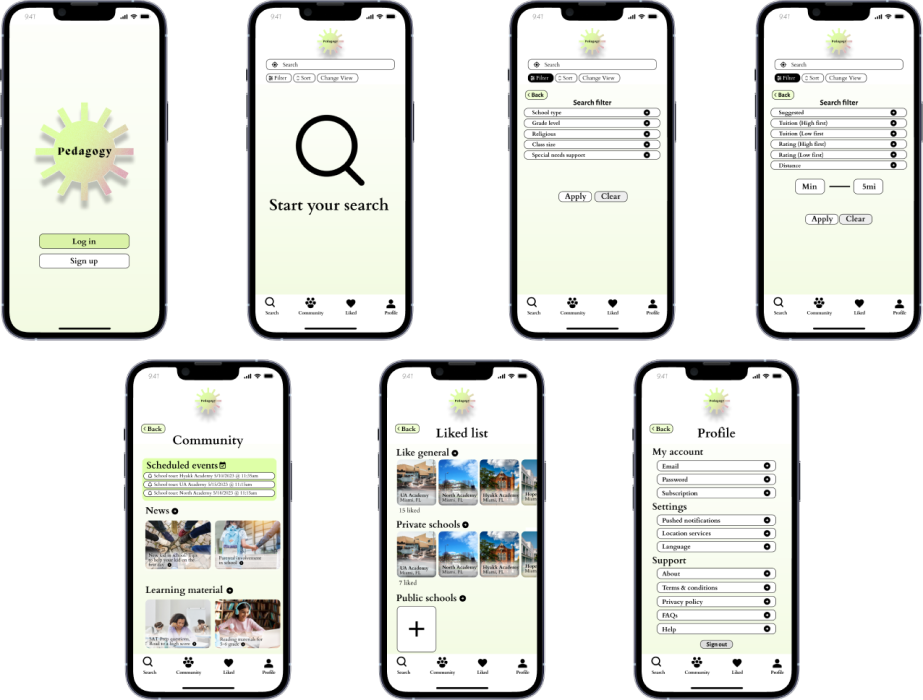
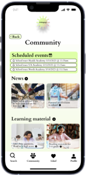
User flow prototype
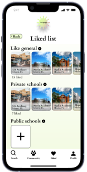
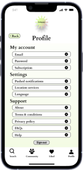
There were six screens in the prototype that demonstrated the intended user flow, in addition to three secondary screens, which displayed more content as well as an interface element. As part of the project, I included a number of features, including filters, sorting, school profiles, and a community page, which contains downloadable learning materials, articles, upcoming events, and a list of all the tours that have been scheduled for the users. I focused on making the steps clear and concise. As a means of presenting the information, I created a visual hierarchy, used typography, and grouped the information into areas where each was deemed suitable.
%201.png)

%201.png)
%201.png)
%201.png)
User testing
It was necessary to conduct a usability test on the prototype once it had been constructed in order to determine what elements seemed to be working well, what could be improved and added, as well as the overall user's experience with the prototype.
A total of five participants participated in the in-person testing, in which tasks involving the flow of the user were performed by them. It was my intention to have them retell and think aloud about the steps they went through as they were being done (think-aloud method). I formed a set of questions to ask the users once they had completed the testing so that I could collect more data and gain the insight that was required.
Results
- All participants were able to finish the task
- Took users between 45 seconds to a 1.3 minutes
- Participants agreed that the process is clear and easy to follow
- The iconography was understood by all participants
- Three users would like to see in the future is feature that allows parents to post and participate in community discussions within the community tab of the app
- One of the features users liked was the ability to arrange a school tour directly from the app
- 1 user suggested a share tool to be able to send the profile to other people if needed
- Rather than an underlined link next to the star rating next to the reviews, users would like to have a more defined way to get to the reviews.
- Found all the filters to be helpful
%201.png)
Insight
- Make it easier for people to access the reviews by implementing a more straightforward method of navigating.
- Allow the users to decide whether or not they would like to make an account after having explored the app enough to be able to use some of its features after discovering it was accessible to them
- In the community section of the app, you can add a discussion board that you can share with future users of the app
- Add a share tool to be able to send a school profile to others outside of the app
Week 3: HiFi prototype and testing
Visual direction
Based on everything that I have learned over the past couple of weeks, I created a mood board from the information I have gained so far, and used this as a starting point for creating a visual design for the product. Once I had decided what would be a good fit, I applied the usability test insights I had gained from the prototype and applied them to the high-fidelity prototype.
Identity
As I was researching our competitors' websites, I discovered that many of them are obsolete and static, making the process of finding a school arduous for the users. In light of the information I gathered, I made it a priority in the design aspect of the app by incorporating modern elements in the way it looks and feels while being used. Incorporating an attractive design while maintaining an interactive element. It was determined to make the app modern, practical, efficient, and user-friendly. By combining color theory with shapes, users would be able to use the product with a greater level of enjoyment and less boredom.
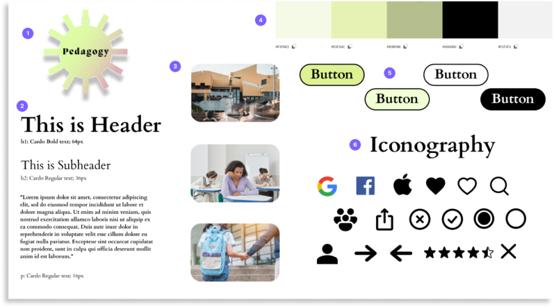
%201.png)
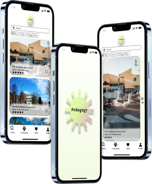
High-Fidelity
Following the development of the style tile and the branding, I started developing the high-fidelity screens as soon as the identity had been established. With the insights and opportunities that I studied from competing products, I was in a position to apply these findings and possibilites to the wireframes I created from my research.
According to the data from the usability testing, I added micro-interactions to complete the high-fidelity requirements amd make the layout more intuitive and usable.
Reflection
It is all in all a satisfying process from beginning to end, and the journey that has led me there has been enjoyable. In the course of my project, I had to work within a very short deadline, produce the necessary outputs and outcomes, and collect feedback both during and after the project. In retrospect, as I look back at my experience, there are things I would have done differently with more time and experience. For example, taking the time to test the visual branding approach more thoroughly with users before settling on a final style. It is true that the product is still far from done, but I strongly believe that we are taking the ideal steps along the way by keeping our eye on competitor products and on user needs.