
National Apprenticeship Week
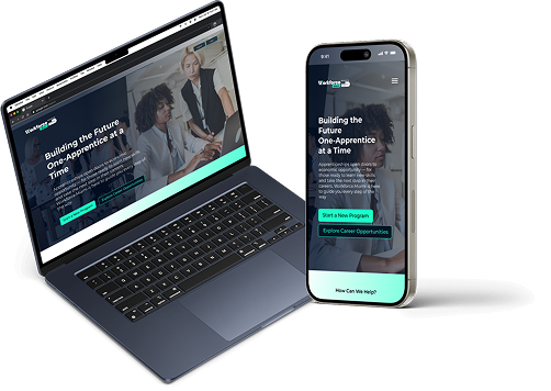
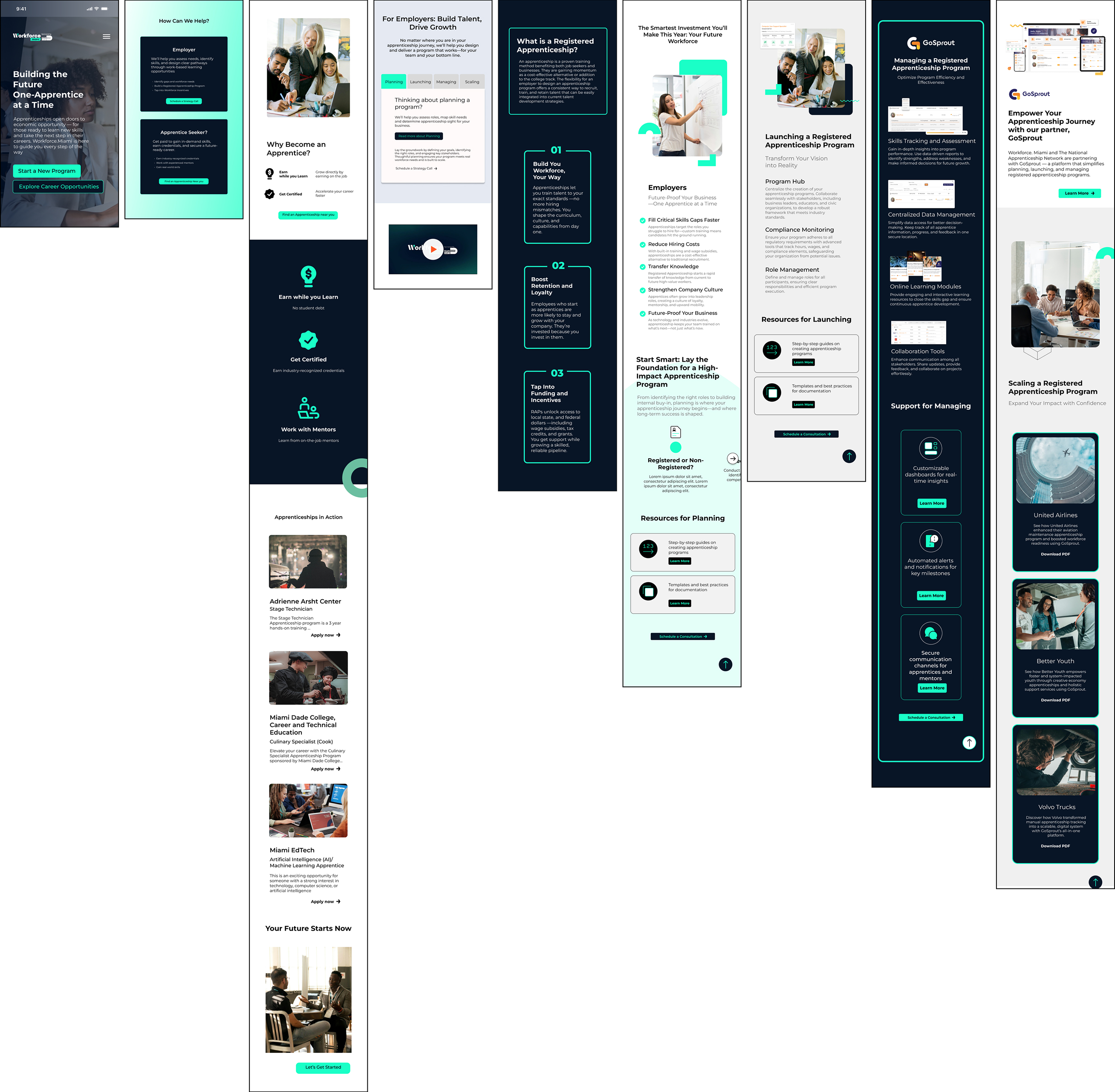
A National Apprenticeship landing page on Workforce.Miami for employers and apprenticeship seekers.
Role
UX/UI designer
Tools
Figma, Wordpress, Web Inspector (for responsive QA)
Target users
Employer Partners (corporations, local businesses, institutions), Apprenticeship Seekers (students, career changers, underemployed residents)
Role
UI designer, Art director
Tools
Figma, Wordpress, Web Inspector (for responsive QA)
Target users
Employer Partners (corporations, local businesses, institutions), Apprenticeship Seekers (students, career changers, underemployed residents)
UI Design
- Landing page structure
- Interactive anchor-based navigation
- Dual-user segmentation (Employer vs Apprentice Seeker)
- Mobile-first responsive design
- Scroll-triggered CTA interactions
- Visual system expansion for campaign
Problem
There was no clear place on the Workforce.Miami site to promote National Apprenticeship Week, explain apprenticeship benefits, or give direct next steps to either employers or potential apprentices.
Goal
- Increase visibility and awareness for apprenticeships in Miami-Dade
- Guide employers to start or scale programs
- Help residents find local opportunities and understand the process
- Tie in GoSprout as the backend apprenticeship management solution
Project
Design a split-focus, scroll-based landing page that clearly addresses both employers and job seekers, while keeping the interface simple, accessible, and campaign-aligned.
Problem scoping
Both audiences (employers & seekers) needed clarity on their roles, benefits, and actions. Page needed to answer:
- “Why should I care?”
- “What do I do next?”
- “How can I trust this process?”
Day 1-2: Research
Day 1: Strategy and Structure
Goal
Outline content flow for both user types (employers and seekers) and define the scroll experience.
Tasks
- Defined two entry points:
- Employer Path
- Apprentice Seeker Path
- Decided on anchor-based scroll navigation for ease of use on mobile and desktop
- Sketched how the four-part employer journey (Planning, Launching, Managing, Scaling) would be revealed progressively — like sectioned chapters
- Added “back to top” button logic to reduce scroll fatigue
- Drafted wireframe for apprentice section with three key modules:
- Why Become an Apprentice?
- Find an Apprenticeship
- Apprenticeships in Action (story-focused layout)
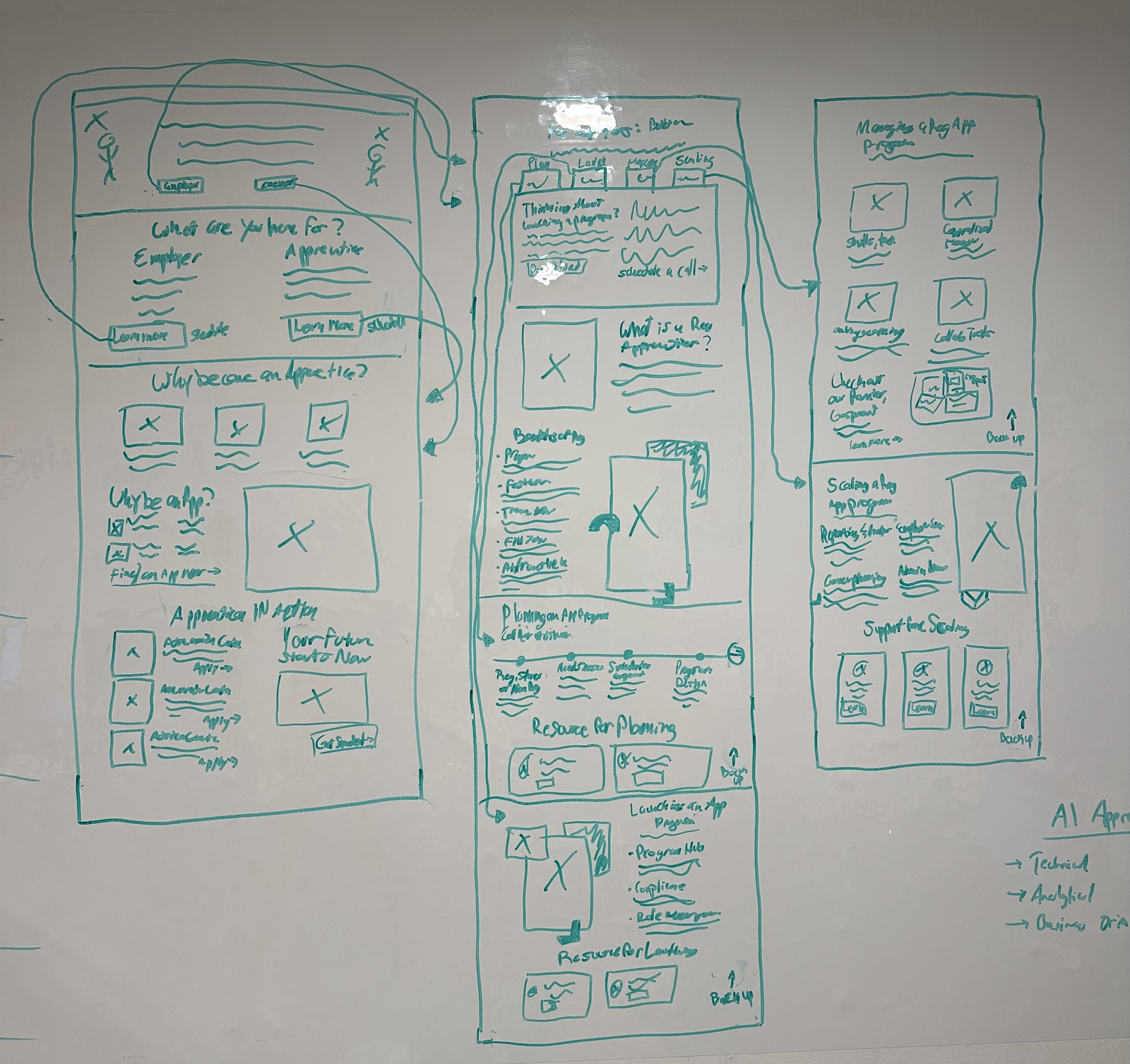
Day 2: Low-Fidelity Wireframes in Figma
Goal
Translate sketches into digital wireframes and prep layout logic for responsive build.
Tasks
- Built basic component layout for:
- Hero section with campaign branding
- Two segmented user options
- Employer journey cards with anchor navigation
- Section headers and sub-navigation flows
- Ensured wireframes supported:
- Scroll snapping
- Click-to-scroll navigation
- Smooth user transitions between content
- Added placeholder content and CTA behavior (e.g., hover and tap states)
- Shared wireframes with stakeholders for feedback
.png)
Day 3-5: Visual Design + Review
Day 3: High-Fidelity UI Design in Figma
Goal
Apply Workforce.Miami’s existing brand style to the wireframes while making the page feel like a fresh campaign.
Tasks
- Imported wireframes into Figma and started high-fidelity UI
- Expanded the existing color palette to include campaign-accent colors for National Apprenticeship Week (brighter CTA orange, deeper blue overlays)
- Set typographic scale for hero, body, subheadings, and mobile text
- Created visual hierarchy using:
- Bold titles and color-coded sections for employers vs seekers
- Horizontal cards for the employer flow (Planning → Scaling)
- Scroll-triggered CTA buttons and anchor highlights
- Designed hero banner using a combination of title, subtitle, and CTA with high contrast and civic energy
%202.jpg)
Day 4: Component Styling & Mobile Views
Goal
Ensure a polished, consistent design system across all breakpoints.
Tasks
- Imported approved wireframes into Figma
- Applied Workforce.Miami’s color palette, typography, and grid system
- Created a visual split between Employers and Apprenticeship Seekers through color cues and layout differences
- Designed hero banner with campaign-driven messaging, CTA, and a soft gradient overlay for visual depth
- Developed horizontal tab navigation for the employer section:
- Planning → Launching → Managing → Scaling
- Within each section, I added a “scroll-to-top” arrow button to return users back to the 4-option navigation
- Scroll-to-top button designed with a minimalist ↑ arrow icon in circle, sticky only within the bounds of the selected section
%201.png)
Day 5: Stakeholder Review & Final Adjustments
Goal
Test responsiveness, share with stakeholders, and refine visual polish based on feedback.
Tasks
- Shared clickable prototype with stakeholders
- Conducted internal QA on anchor links, scroll-back behavior, and mobile performance
- Feedback implementation:
- Increased size of upward scroll arrow for easier mobile tapping
- Adjusted spacing between employer section headers and content blocks
- Strengthened contrast in the apprentice CTA block for readability
- Reworded GoSprout text for clearer partnership messaging
- Finalized visual handoff for CMS build in WordPress
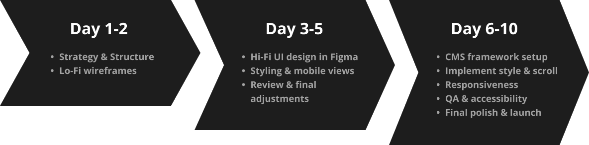
Day 6-10: CMS Build, QA & Responsiveness Tuning
Day 6: CMS Framework Setup
Goal
Establish a flexible, editable structure in WordPress that matches the Figma layout and allows for future content updates without breaking design.
Tasks
- Created a custom page template within the existing Workforce.Miami WordPress theme
- Defined editable regions using Advanced Custom Fields (ACF)
- Mapped out structure:
- Hero banner
- Employer section with 4 scroll targets: Planning, Launching, Managing, Scaling
- Apprentice Seeker section with 3 blocks: Why Become an Apprentice?, Find an Apprenticeship, Apprenticeships in Action
- Footer with partner logos and calls to action
- Connected anchor links to navigation buttons for scroll-to-section behavior
Day 7: Style Implementation & Scroll Functionality
Goal
Translate Figma visuals into responsive layouts and interactive scroll behavior.
Tasks
- Applied CSS styling to match Figma specs: colors, font sizes, spacing, and visual hierarchy
- Built scroll-based navigation logic:
- Clicking "Planning", "Launching", etc. scrolls to respective section
- Within each section, a “scroll-to-top” arrow button is shown — styled minimally with ↑ icon
- Clicking the arrow scrolls user back to the 4-option employer menu
- Implemented sticky behavior for section headers (on mobile, section headers remain visible briefly for orientation)
Day 8: Mobile Responsiveness
Goal
Ensure the layout is clean, intuitive, and easy to navigate on smaller devices.
Tasks
- Adjusted layout for vertical stacking on mobile
- Increased button and scroll-target tap areas
- Ensured "scroll-to-top" buttons were large enough for thumbs without interfering with content
- Tuned typography for legibility (adjusted line-height, font sizes, spacing)
- Tested scroll anchor logic on mobile — confirmed that returning to the employer menu worked seamlessly without jank
Day 9: QA & Accessibility
Goal
Conduct a full quality assurance pass and meet accessibility best practices.
Tasks
- Cross-browser testing (Chrome, Safari, Firefox)
- Device testing (iOS + Android, multiple screen sizes)
- Verified:
- Anchor link smooth scroll behavior
- Scroll-to-top arrows appear only inside employer sections
- Buttons are keyboard accessible
- Color contrast meets WCAG standards
Day 10: Final Polish & Launch
Goal
Finalize visual tweaks, performance enhancements, and deploy the live page.
Tasks
- Optimized image sizes and compressed assets for faster page load
- Cleaned up spacing between sections for visual breathing room
- Reworded a few CTAs for clarity and consistency
- Ran performance checks using browser dev tools (Lighthouse + Chrome Inspector)
- Published ahead of National Apprenticeship Week launch date
- Monitored live page for any issues and made quick post-launch refinements
Reflection
This project challenged me to design for two distinct audiences while keeping the experience clean and intuitive. Creating scroll-based navigation with anchored sections and a targeted scroll-to-top interaction helped guide users through complex information without overwhelm.
It was also a great exercise in translating Figma designs into a responsive, CMS-friendly build — all while supporting a meaningful mission to connect Miami-Dade residents and employers through apprenticeships.